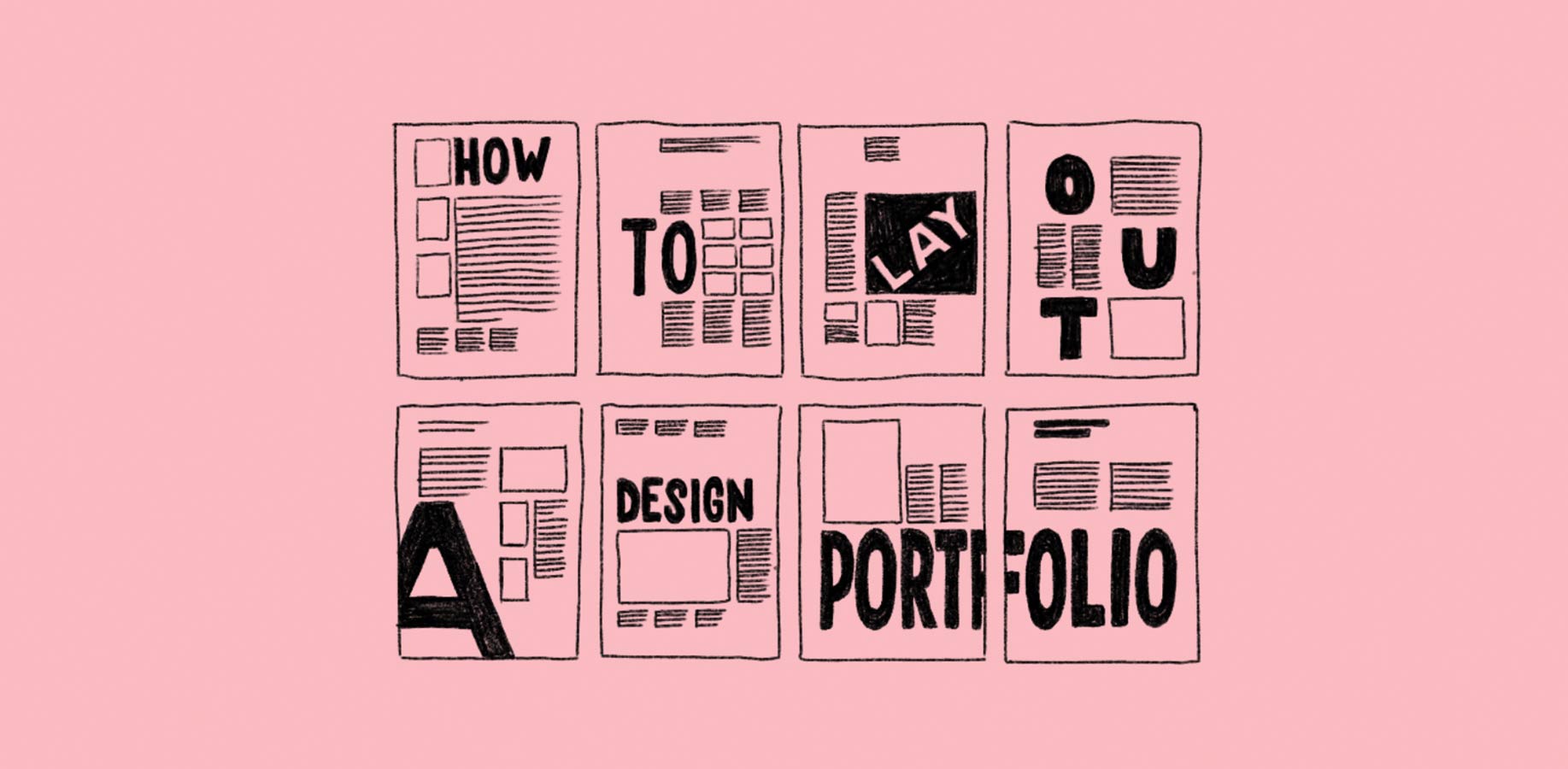
How to lay out your design portfolio
How to lay out your design portfolio
Dieter Rams: Less But Better.
Written by Dave Greasley on 23.07.2020
Dieter Rams: Less But Better.
Written by Dave Greasley on 23.07.2020
So for this article we’ll be touching specifically on PDFs and printed portfolios you may take to an interview. We’ve talked previously about the pros & cons of an online portfolio so go have a looksie over there for more info on that side of things.
Tips for laying out your PDF Portfolio
FIRST: Your introductory ‘E-mailable’ PDF is not the same as your printed PDF. See them as 2 separate things & they’ll be a lot stronger.
Q. What is the job of a PDF portfolio?
A. To give a snapshot of what you can do & leave the viewer wanting more.
- Keep it short, 3-5 projects max
- Design with the device in mind (tiny text probably won’t get read)
- Don’t over-complicate it with crap like page numbers or your website in every corner
- Do make it bespoke - it takes seconds to add the recipients name and a nice intro to the cover
- Don’t overly brand yourself. Keep it simple & let your projects sing
- Do include roughs, sketches, unused concepts
- Don’t use anything you’re not 100% happy with
- Don’t use the logo for your uncle’s plumbing business just because it was ‘real’ – use projects because they’re good
- Don’t show arty macro angles of the 60 page brochure you’ve designed, we want to see the content, the grid, the variety of layout etc, not image porn
- Do keep it under 10MB. Some studios will even have blockers at 5MB.
- Do avoid sending links to a Dropbox/Google Drive, it looks messy and screams 'download my virus'.
- You don’t have to show everything, hold some back for your interview
We’ve designed up a quick example below. This is for a rough guide to show you the rationale behind WHAT to show, not HOW to show it, so don’t copy it!
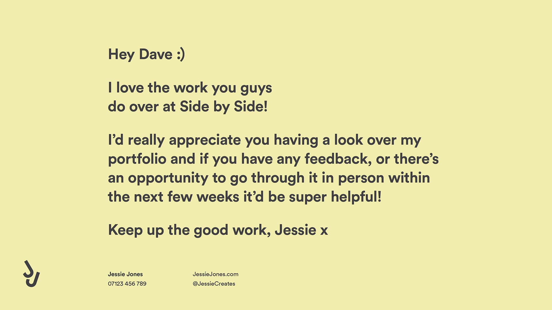
Page 1: We’ve included the recipients name & company on the cover – people will appreciate the effort. We’ve also paid old Dave a couple of compliments, never a bad way to break the ice. Notice how we’ve kept Jessie’s brand simple, her approach friendly and only used her essential personal details. Also be aware that we’ve suggested a date to meet up (within next few weeks) this minimises the chance of the studio forgetting to respond.
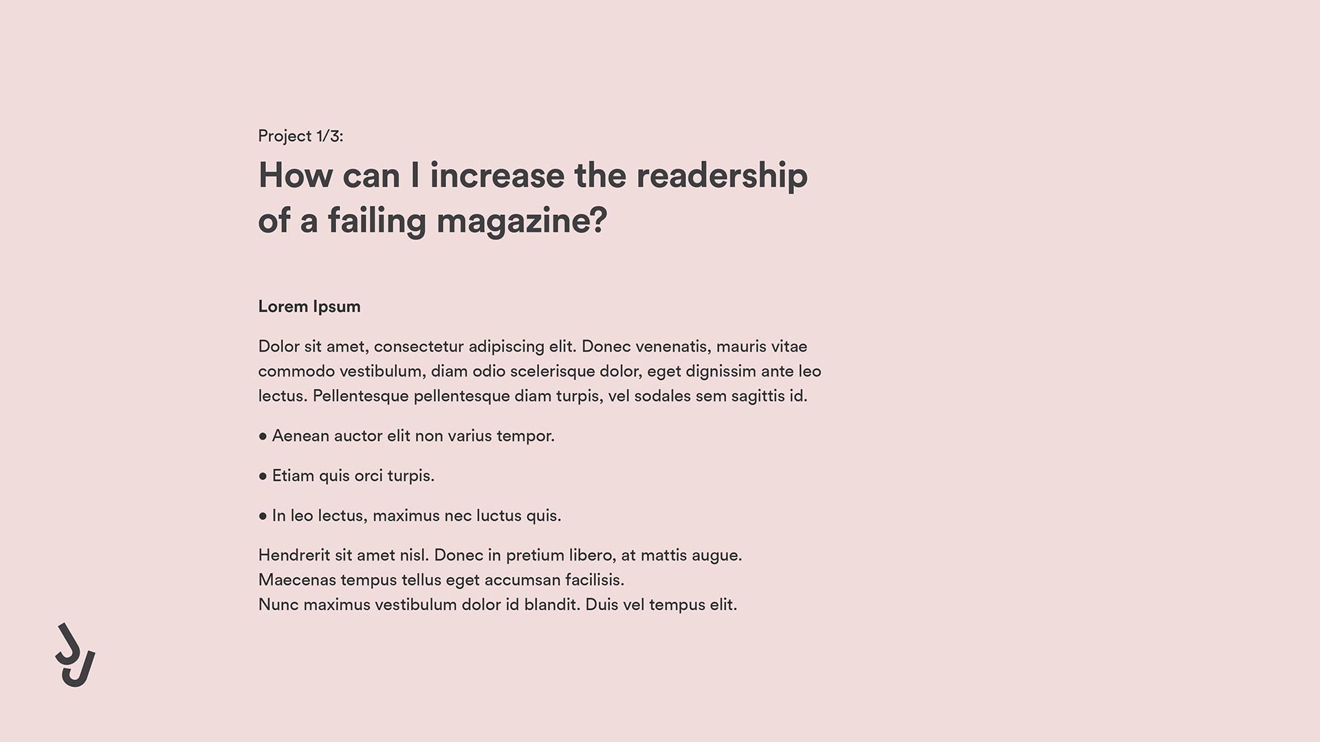
Page 2: Here we’ve introduced the first project, you’ll notice '1 of 3', this lets the recipient know they’re not going to be here all day :). We’ve kept the copy short, and included a few quick bullet points, which could be the deliverables of the project and a short space at the bottom to write about the outcome or impact. We suggest keeping the text large & on a separate page, as when you try to squeeze it all onto one page the layout becomes uglier & the copy is less readable.


Page 3/4/5: We then have 3 pages to present your project visuals. We’d suggest using the first page to set the scene. This could be sketches, unused concepts, pictures of you doing research or the ‘old design’, before you redesigned it. The following pages should then be used to show the finished project. Use the best imagery you have, you can always hold some back for the interview stage.
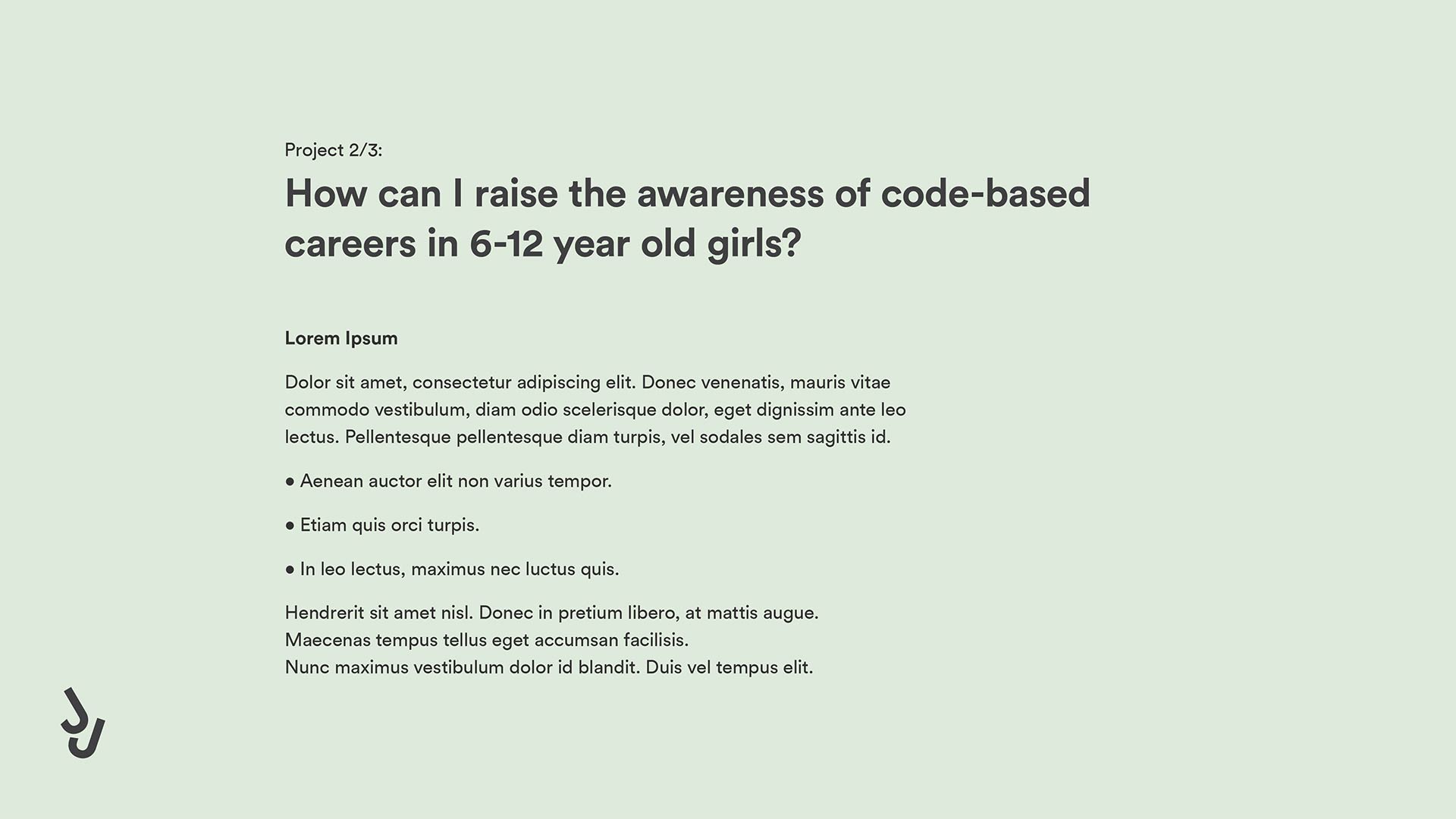
Page 6: Notice now how we’ve gone back to a standard layout to introduce the next project, this adds familiarity. You’ll see we’ve used a different colour scheme, simply to let the viewer know they’re onto a different section. The title of the piece is again a ‘problem’ – graphic design is all about solving problems, so consider how you can tweak the title to make it impactful or engaging.


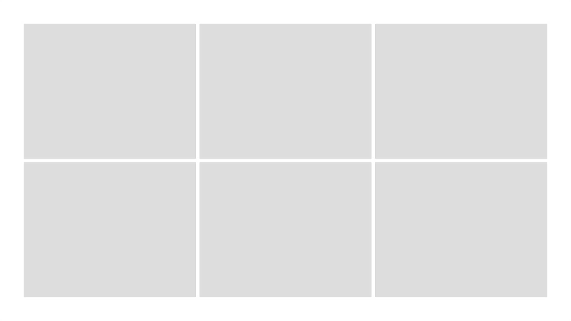
Page 7/8/9/10/11/12: Follow a similar structure for your next projects. If you have links off to websites, make them bold & clickable.
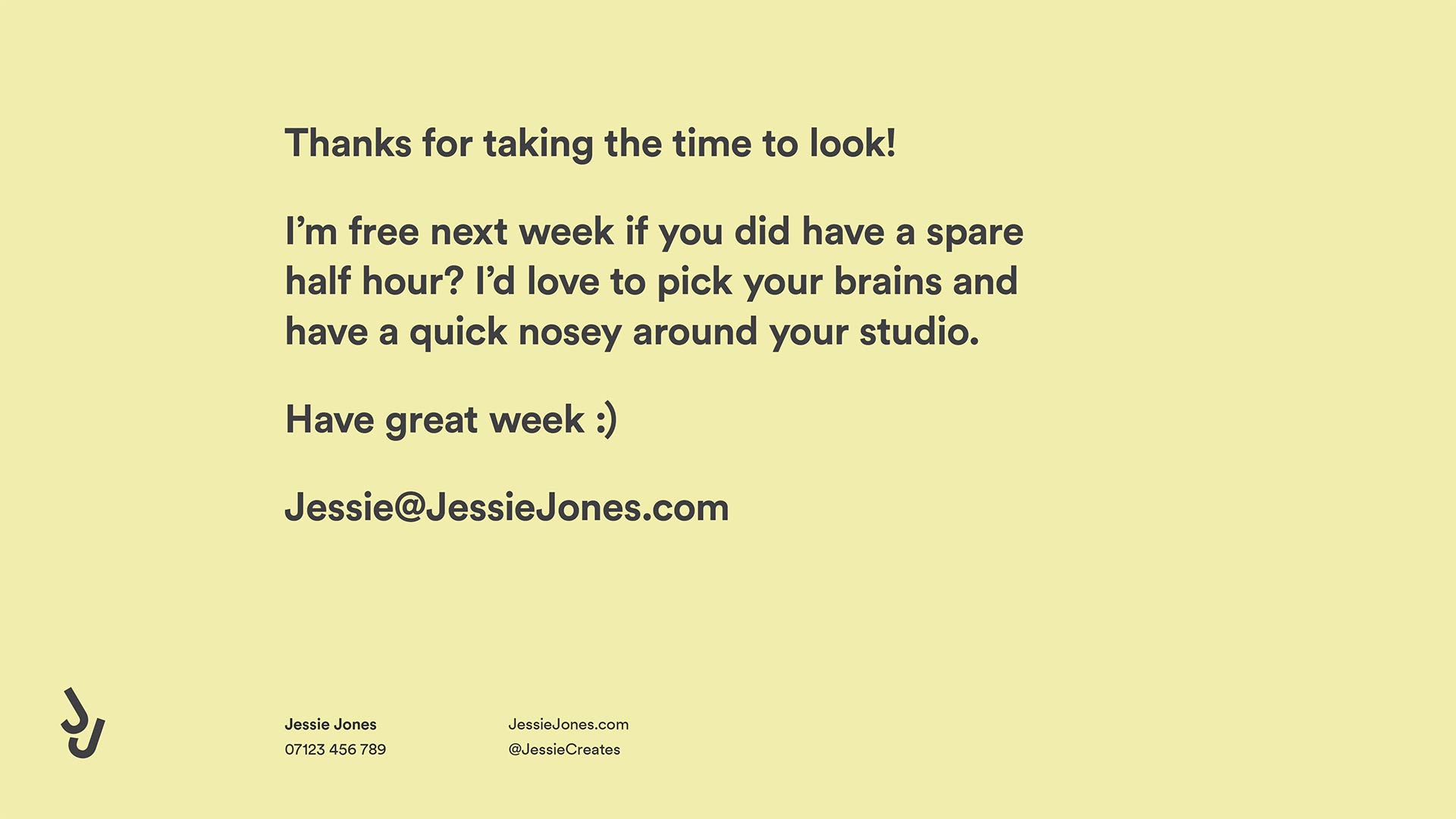
Page 13: We’re now back to the original colour scheme & a final message from Jessie thanking the viewer for his time. She reemphasises her upcoming availability, pays another compliment, signs off in a friendly way, and finishes prominently on her email address, making it as easy as possible for the studio to respond.
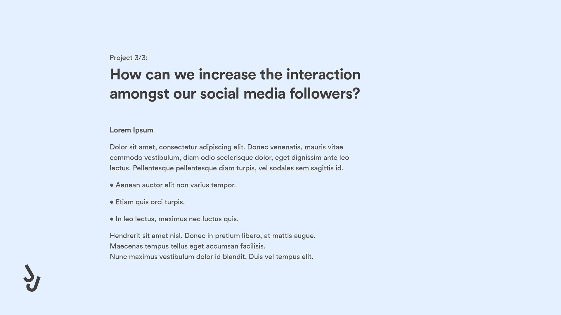
Making it bespoke to each studio
Now that you have a layout, it’s worth considering how it can be bespoke. We mentioned making the cover page unique, but the projects themselves could also change to better represent the style of the studio. If you have a collection of 6 projects, choose around 3 that best represent what that studio currently does.
Most studios aren’t looking to radically change their style, so consider where you’re sending it and tweak your portfolio to include projects you feel compliment theirs.
Preparing your printed portfolio
So, you’ve got through the door, and you’re taking some work to show the agency. Usually you’ll have around 45-60 mins, so I’d look to take around 6 pieces, plus some physical mockups, sketch books and any personal work. A typical A3 portfolio with sleeves will do the trick. Ensure your portfolio is neat, no coffee stains or dog-eared pages. If you have video/animation work, bring a laptop or iPad (fully charged & dodgy website tabs closed).
For your personal work, give the a sense of who you are, your hobbies/interests. Being passionate about anything (your obsession with 90’s skate culture or even your American cereal box collection) is a GOOD thing.
For more advice on the interview itself, have a look over here.
Written by Dave Greasley on 23.07.2020
Follow the studio on Instagram and Twitter
Written by Dave Greasley on 23.07.2020
Follow the studio on Instagram and Twitter
Share:
Share:
More like this
More like this
Want a question answered?
Email us advice@sidebyside.co.uk
Want a question answered?
Email us advice@sidebyside.co.uk

Over the last few years we've become a little jaded with the whole design industry. As we've grown as a business – and more importanly, people – we've seen the importance of helping others, and giving back. We've learnt a hell of a lot during our careers, mostly from fixing fuck-ups, and we want to share this knowledge.
We can see the pitfalls of this industry (we've lived it) and now we're in a position where we can help, rather than just moan about it. We've listened to many a student and young designer asking the same questions, so we know there's a scarcity of answers out there. No inspirational quotes. Just gritty, honest, insights.
Gain Knowledge. Give Knowledge.
