“If you're after something very special, these are the guys for the job. Dave and Oli are a pair of creative nutters – but in a completely traditional and professional manner.
Anything these guys can’t dream isn’t worth dreaming.
It's been an absolute pleasure to have worked with them and I'm sure it won’t be the last.
I did my fair share of research on brand agencies and Side by Side was a breath of fresh air, completely aware of where I wanted to position my company. 18 months later and we are one of the fastest growing beauty brands in the UK, shipping to 36 countries worldwide.
I’m fairly sure I owe much of that success to the sensational brand Oli and Dave created. Great work guys  .”
.”
Rebecca Crawforth, MD
Project Overview
A premium, industry-shaking brand, for the ’Gram generation. Navy Professional craft bespoke tools for the beauty industry. Their tenacious approach to brand building has seen fans grow by the tens of thousands, including the Kardashians and Vogue.
The brand has become an overnight success, with a waiting list of customers desperate to get their finely manicured hands on the next product drop.
Deliverables
- Brand Strategy
- Messaging
- Brand Identity
- Icons, Assets, Illustrations
- Packaging Design
- Product Photography
- Brand Guidelines
- Social Media Templates
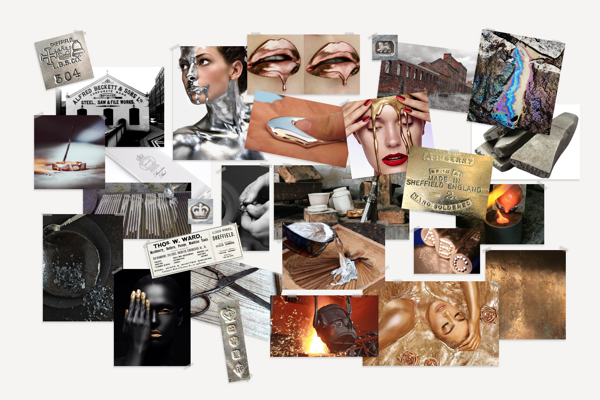
Exploring the Unknown
Navy’s identity started with a journey into a thriving industry, one that we’d had little previous experience in. Often a pair of fresh eyes is exactly what’s needed to shake things up.
Our exploration into the beauty market highlighted many dated trends and cliched imagery to avoid. Instead of looking at the current scene for inspiration we turned to the history books, delving into Sheffield’s steelmaking heritage to find our muse.
Manufacturing marks and steel melting techniques influenced our initial thinking. We wanted a premium brand, but with the grit and strength of the industrial revolution.
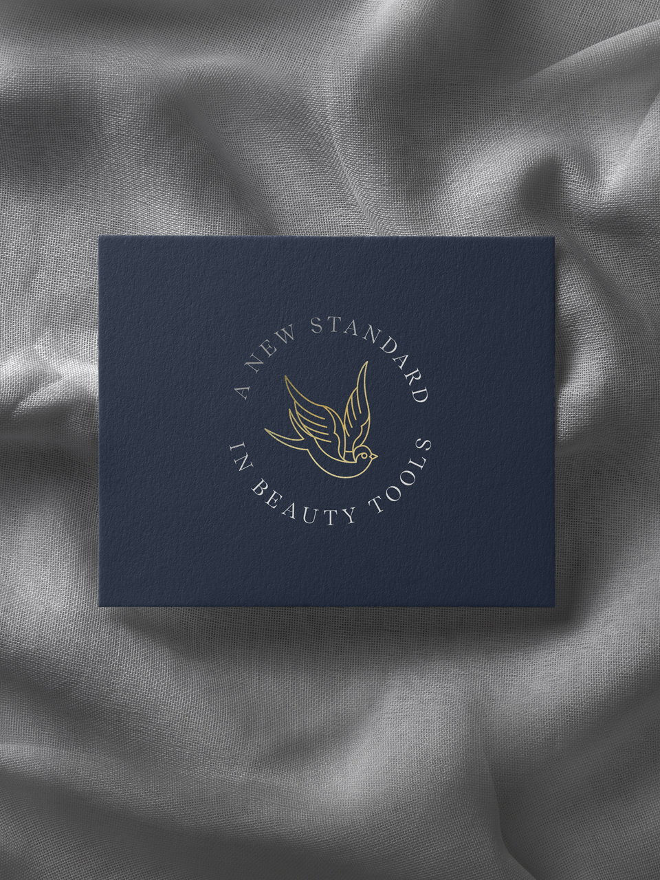
My Favourite Bird…
A passing remark, when we were quizzing Rebecca on her likes & dislikes, lead to the core concept of the Navy brand.
“…my favourite bird is the swallow, my grandad had them tattooed on his hands.”
Having read a book on traditional tattoos a few years previous, we were aware that the swallow was used to represent the nautical prowess of sailors. One swallow tattoo showed the person had travelled over 5,000 miles by sea, two represented 10,000. In more recent years the swallows were used in the Royal Navy to illustrate a successful voyage.
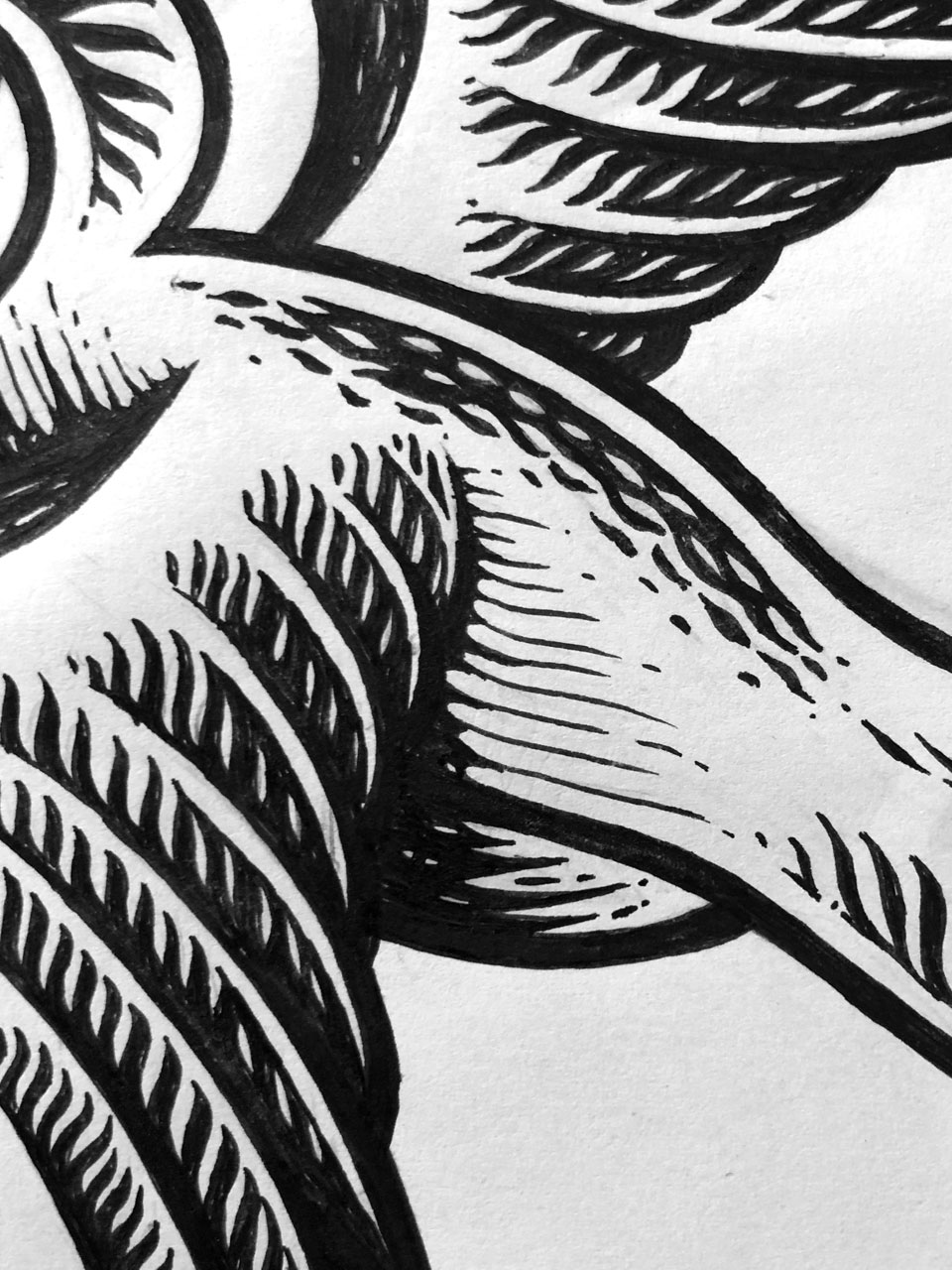
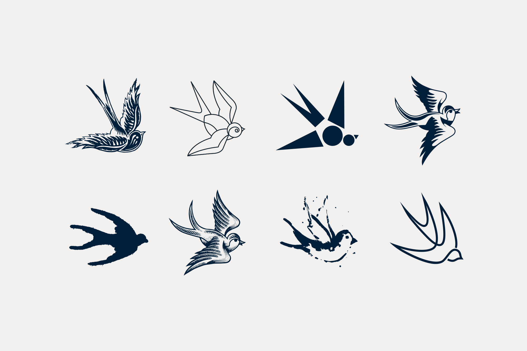
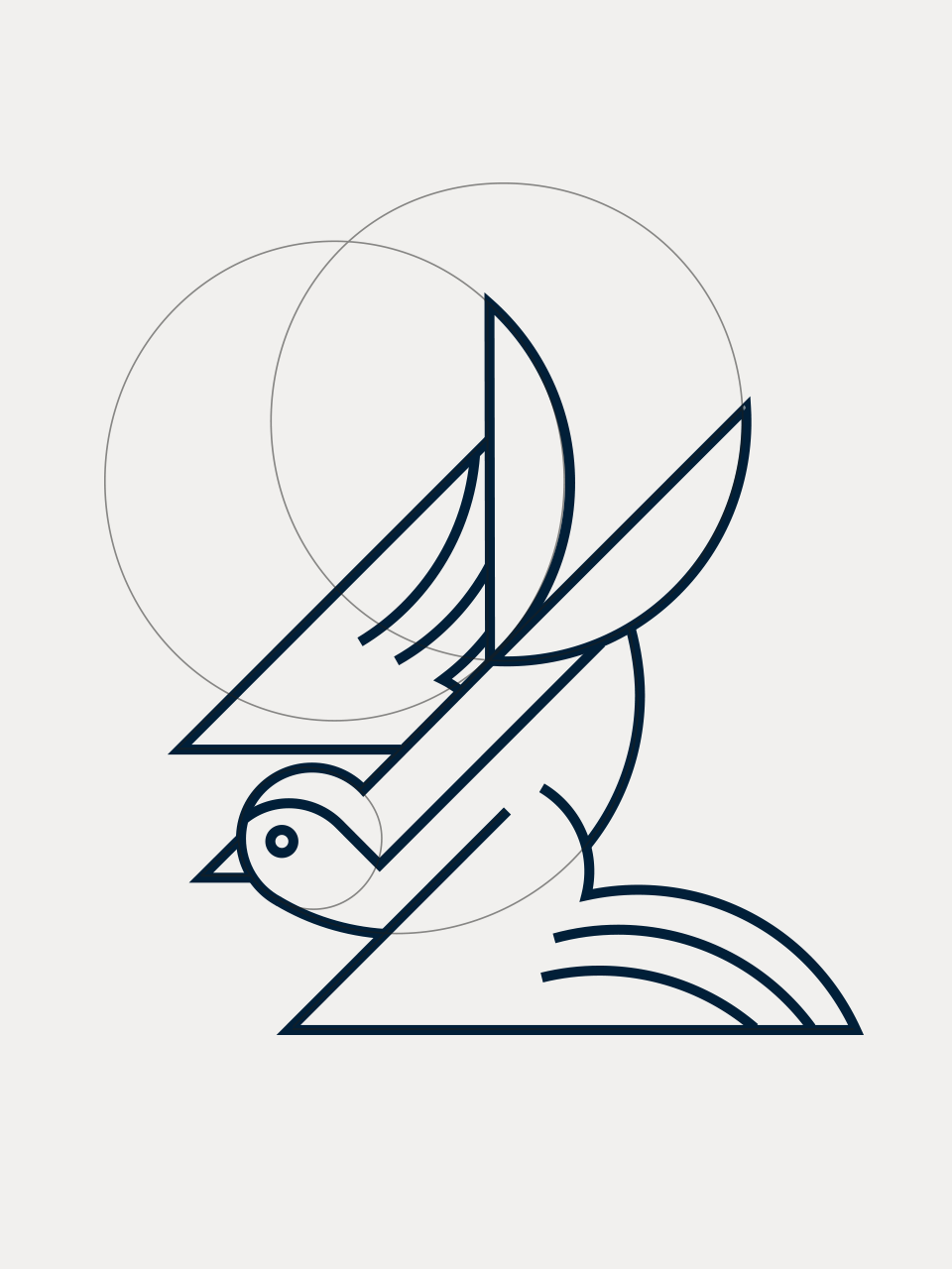
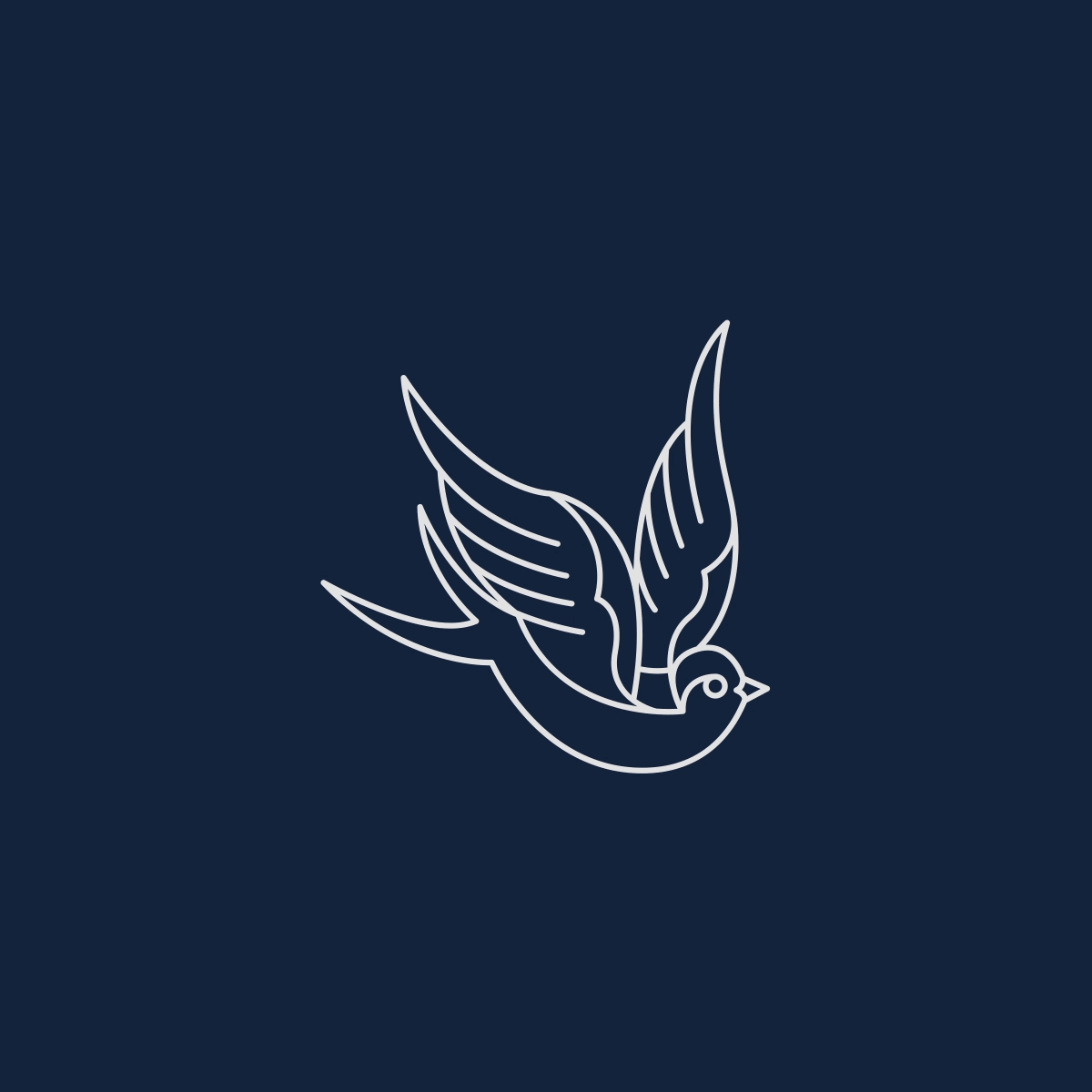
The links were too prominent to ignore, the Swallow was here to stay.
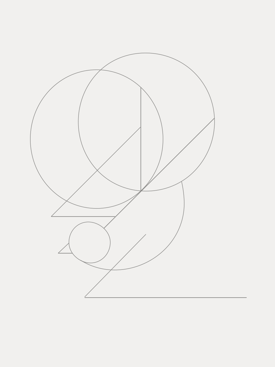
We tried multiple styles of illustration, from abstract to woodcut, until we landed on one with enough style and simplicity to carry the brand.
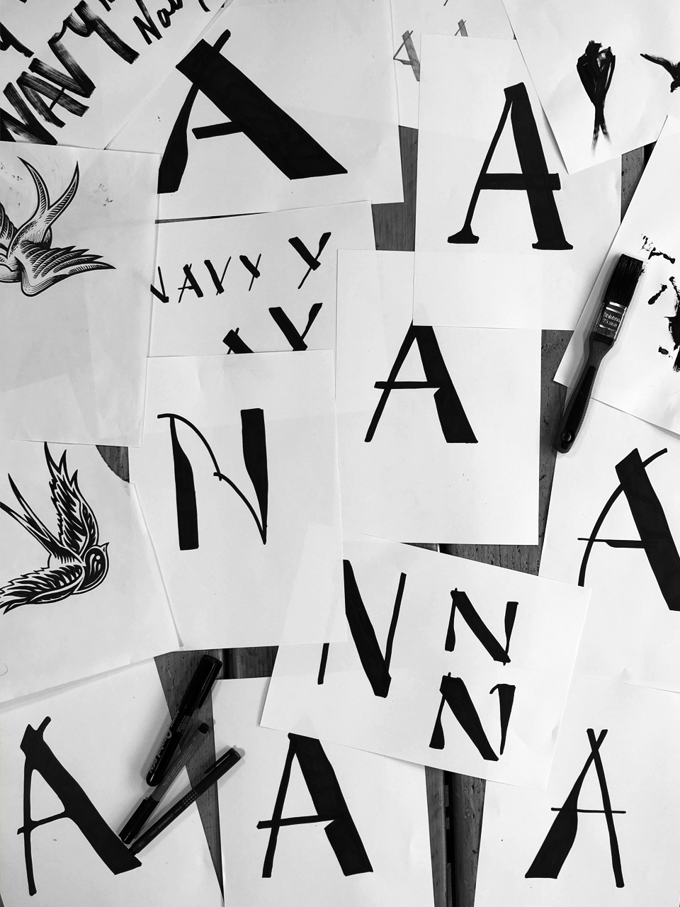
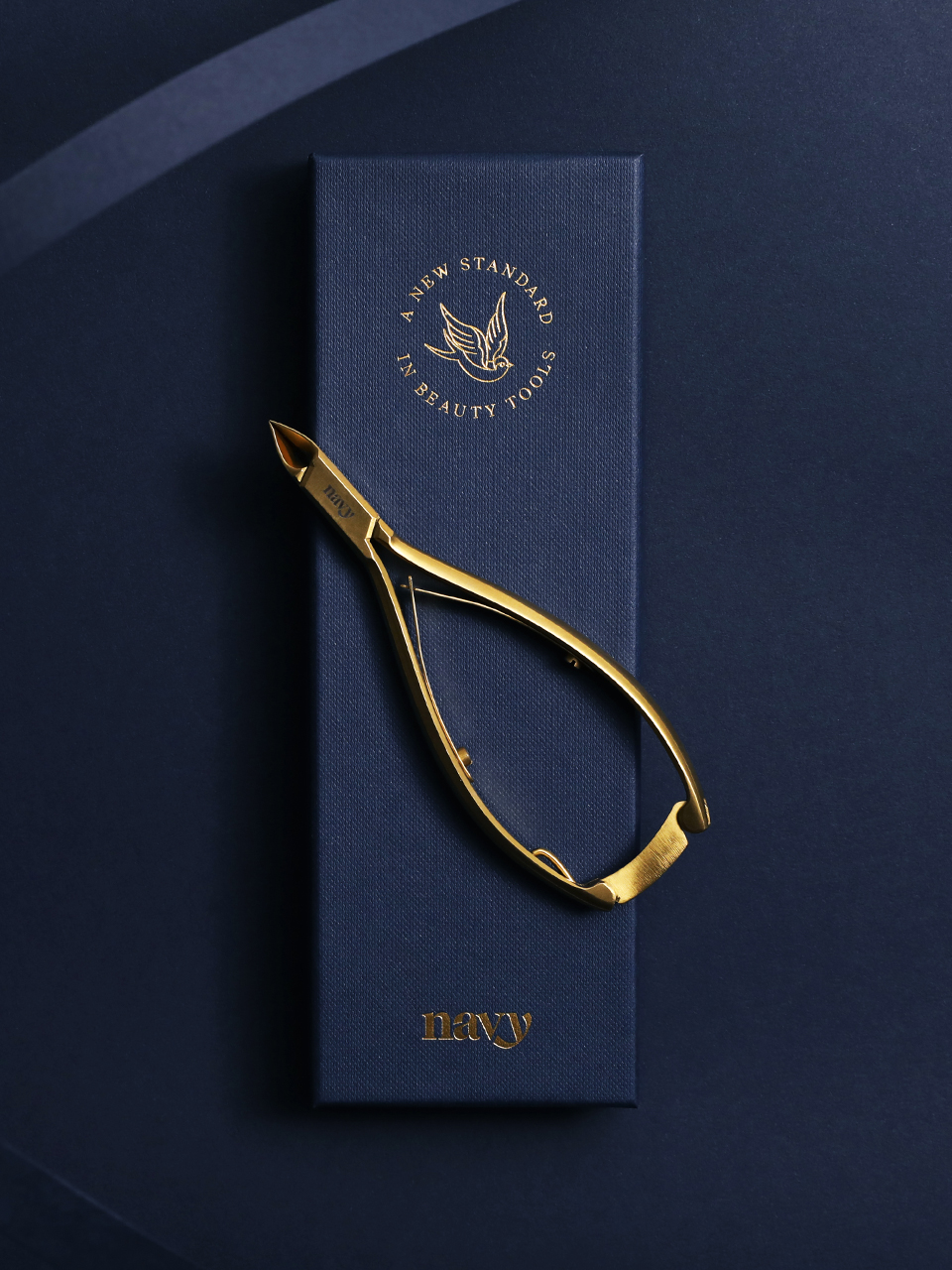
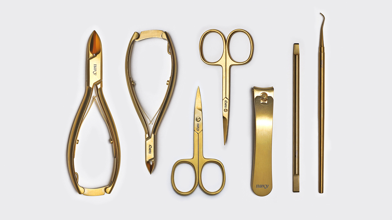
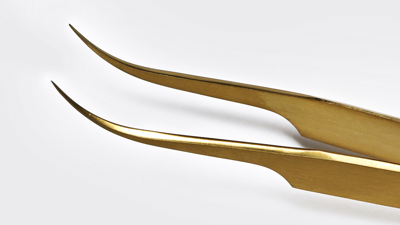
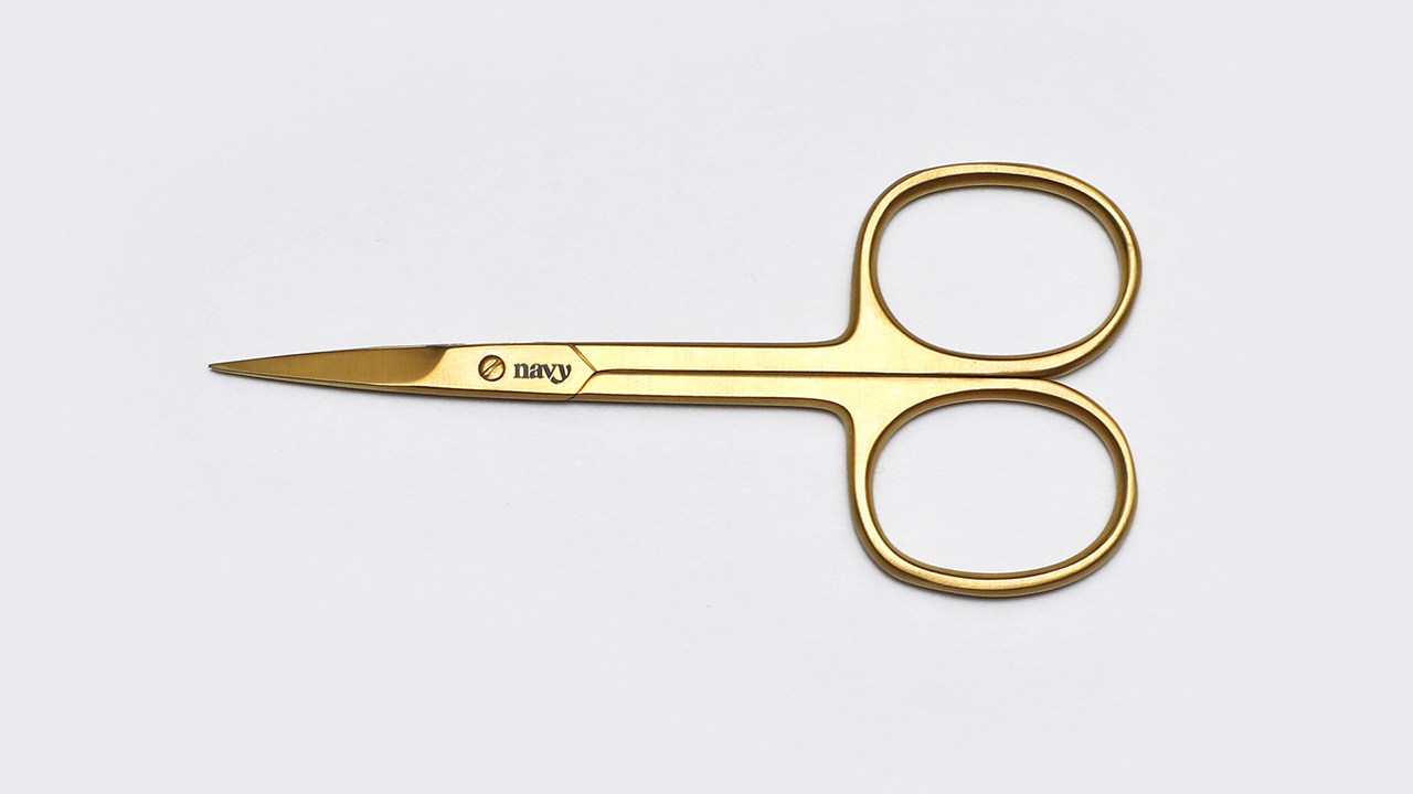
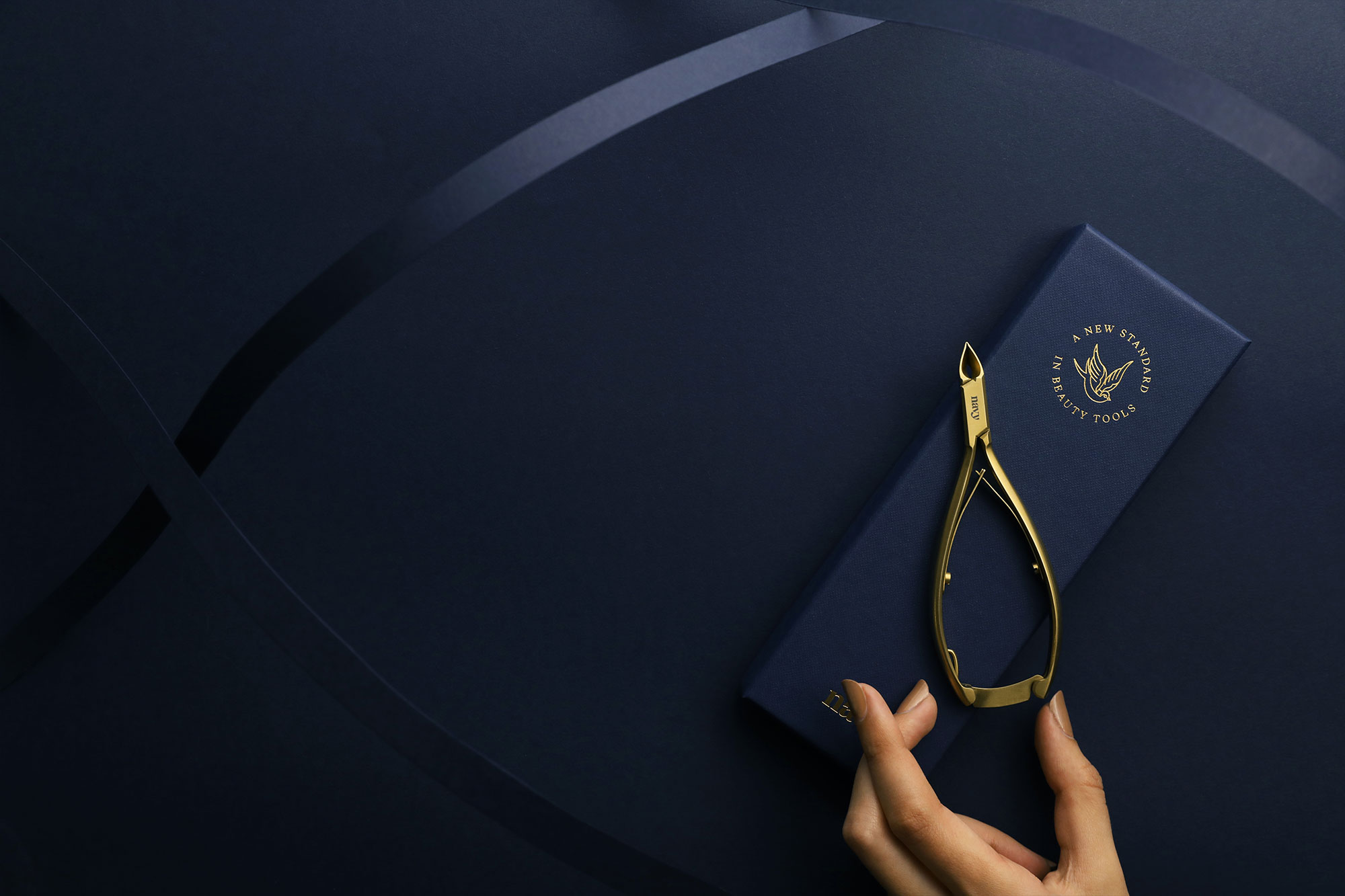
Brand Identity
A bespoke wordmark was drawn, with a sharpness parallel to the tools, and the beautiful curves synonymous with the beauty industry. Luzi Type’s Recife was chosen as an elegant family of fonts to represent the Navy brand.
Laser etching onto tools so fine had its restrictions, the identity got reworked multiple times until it was functional when scaled down.
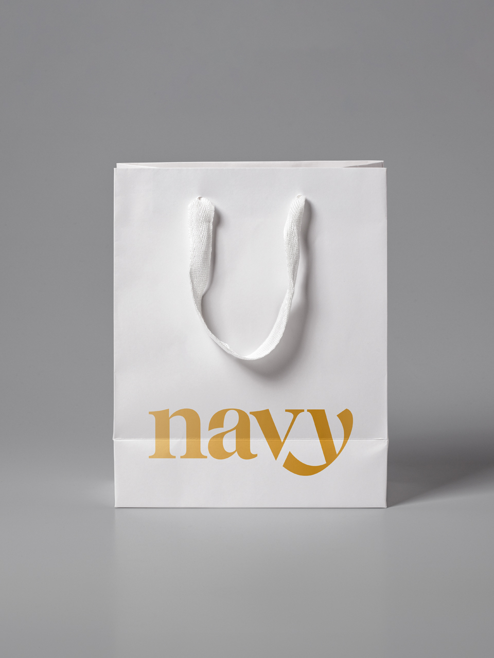
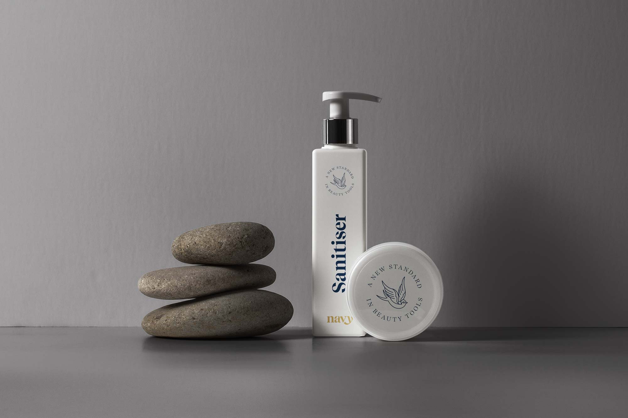
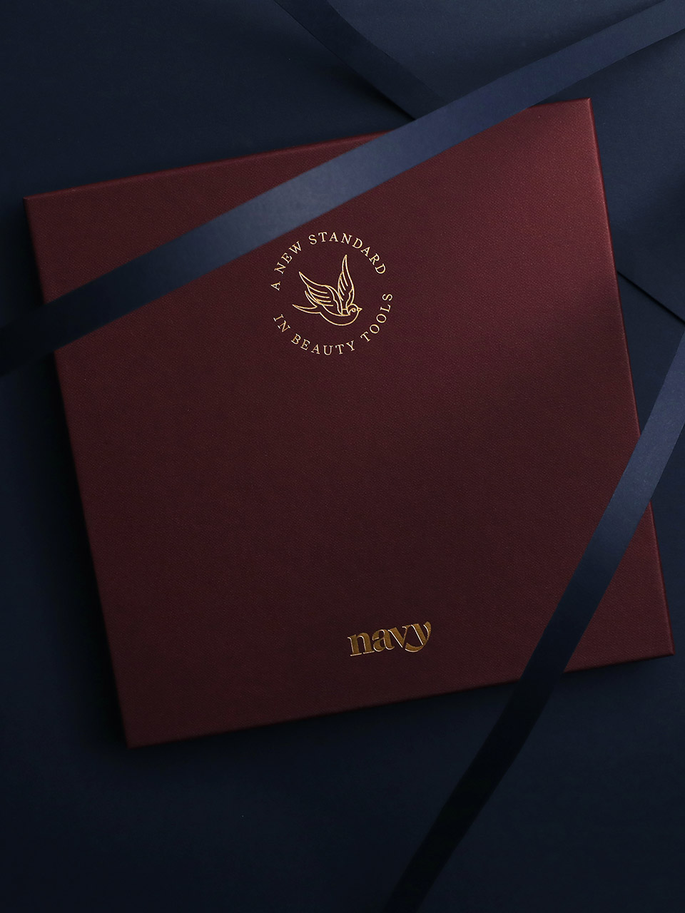
The colours chosen were, of course, drawn from Naval uniforms. The premium palette evoked luxury connotations that immediately set Navy apart from the more ‘Superdrug’ alternatives.
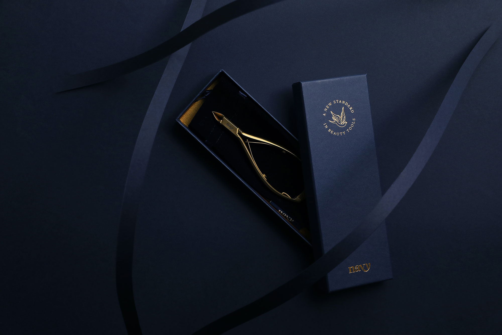
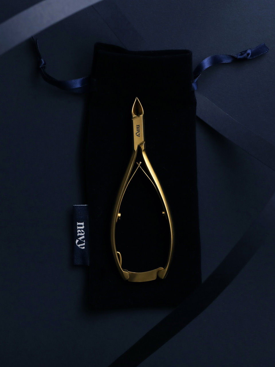
Ranging from £30-£245, the packaging needed to reflect the quality of the products they held. Luxury GF Smith paper-over-board boxes finished with gold foils and foam inlays were selected for their durability and presence.
Unboxing new Navy products has now become a thing within the beauty industry.
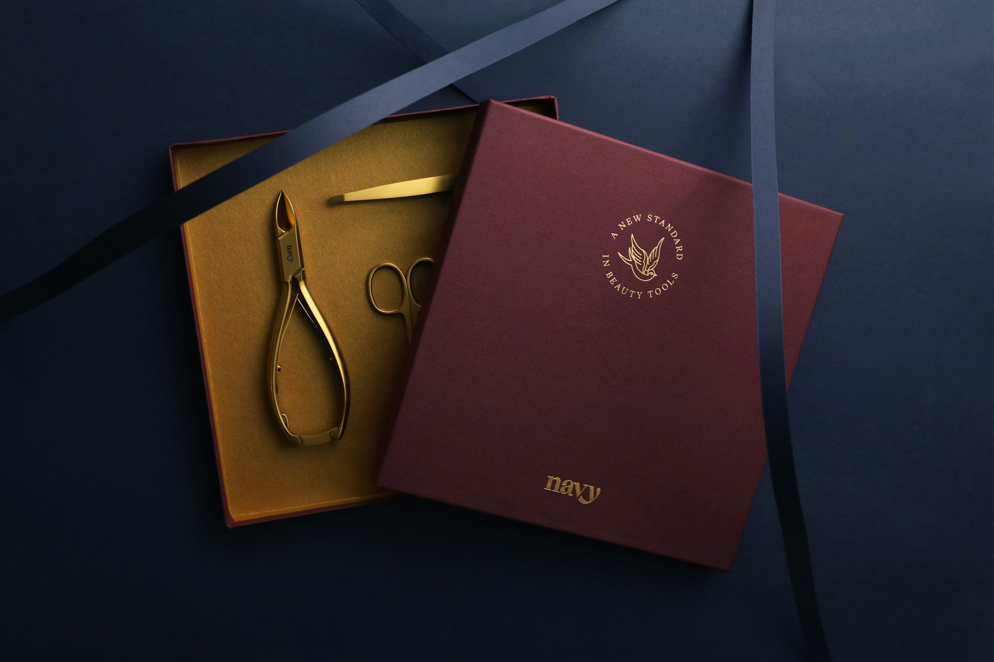
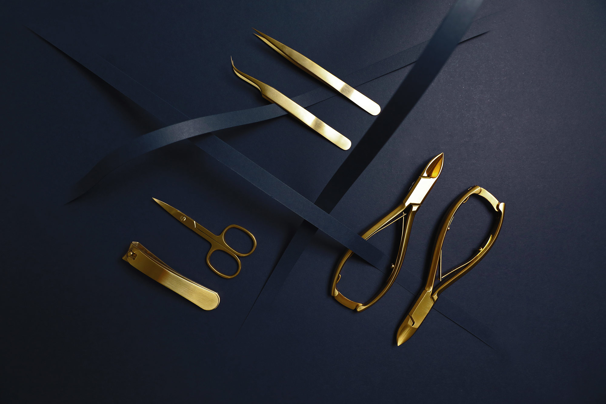
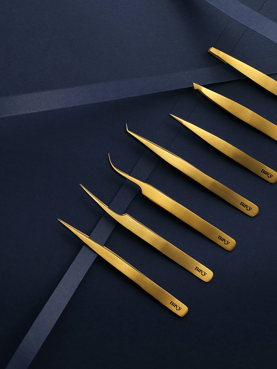
Product Photography
We devised a unique way of photographing the tools, using ribbons of sliced paper to add depth and elegance to the shoot. The flowing strokes of paper echoed the lines of the Navy wordmark and the shadows they cast reinforced the sumptuous mood.
The style has been used to launch the first batch products, and has become a prominent element of the brand.
Organic Social Growth
The key to Navy’s success has been Rebecca’s tenacious approach to social media. Using just a handful of basic guidelines and flexible brand assets, the company has nurtured their following, passing on value at all stages.
In their first year Navy have built a community of 25,000 like-minded professionals, dedicated to the quality of their craft. Through workshops, hygiene advice and a healthy promotion of each other’s work, Navy’s audience have become true brand advocates, resulting in sell-out product drops, and waiting lists for upcoming releases.
More Work
↓
Ready to start your journey?
hello@sidebyside.co.uk
© 2013–2020 Side by Side Creative Limited
© 2013–2020 Side by Side Creative Limited