“Fabulous, it looks amazing. I'm so happy with it!
Thank you for creating a wonderful brand and website. I'm sure it will help our business and brand grow.”
Yee Kwan, Founder

Project Overview
An ice cream brand on a mission to rid the world of vanilla, and tantalise our tastebuds. Since investment in Dragon's Den, Yee's ice cream has gone from strength to strength. With a little help from us they are now the dessert supplier for Wagamama, in premium restaurants and supermarkets all over the UK and are currently breaking into the asian dessert market.
And yes. It is very, very tasty.
Deliverables
- Brand Strategy & Market Insights
- Creative Workshops
- Messaging & Brand Story
- Rebrand
- Bespoke Typography
- Icons & Brand Assets
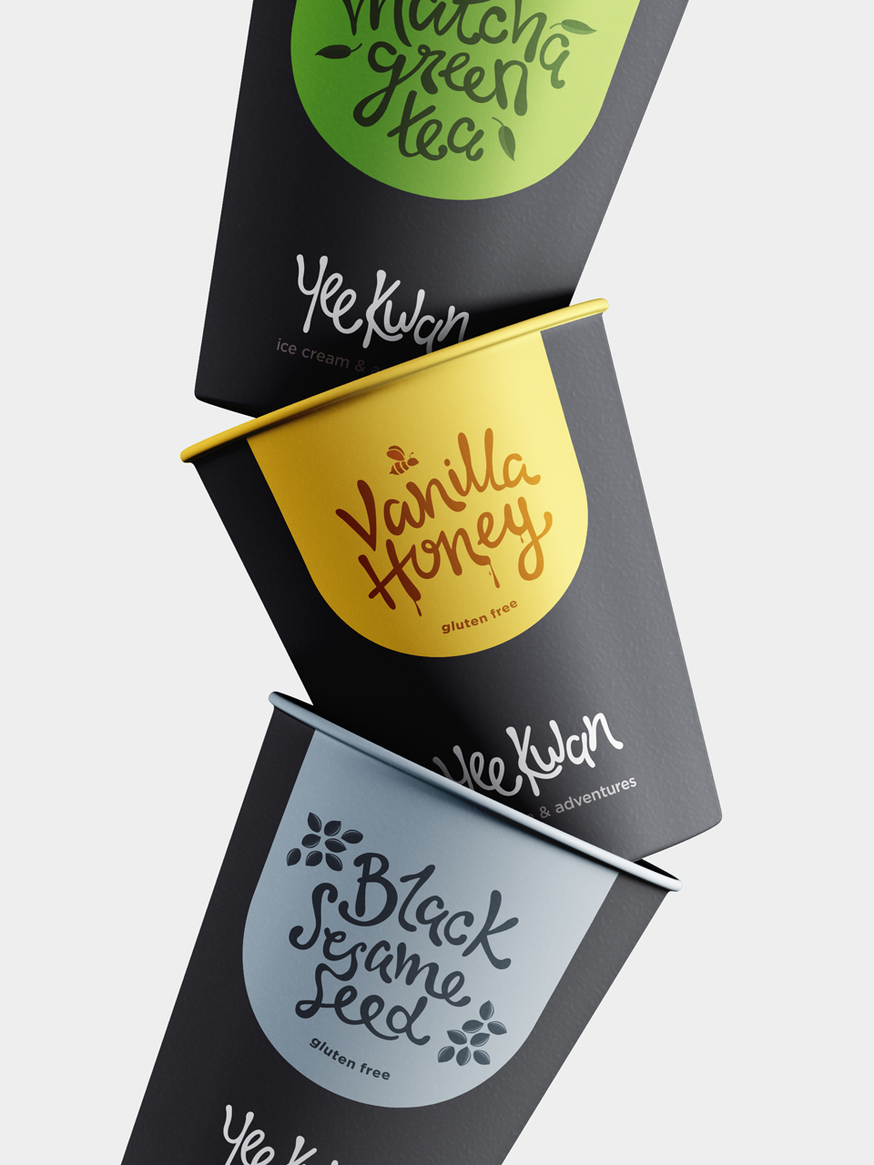
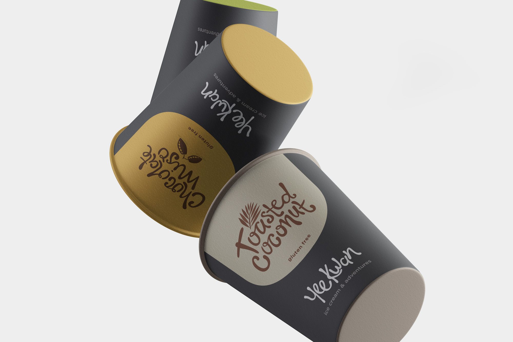
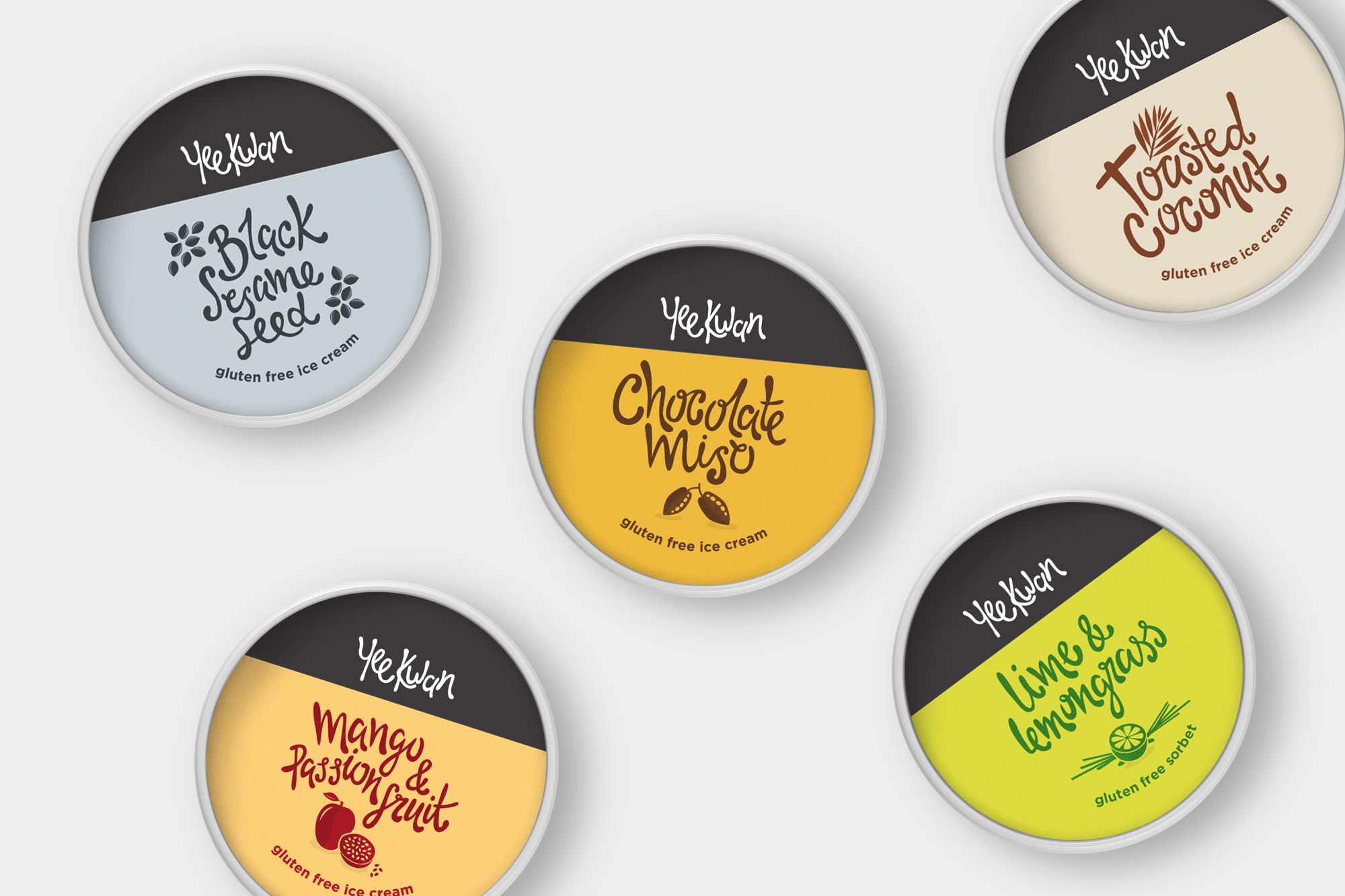
- Packaging Design
- Product Photography
- Brand Guidelines
- Website Design & Build
- Advertising Campaigns
The Identity
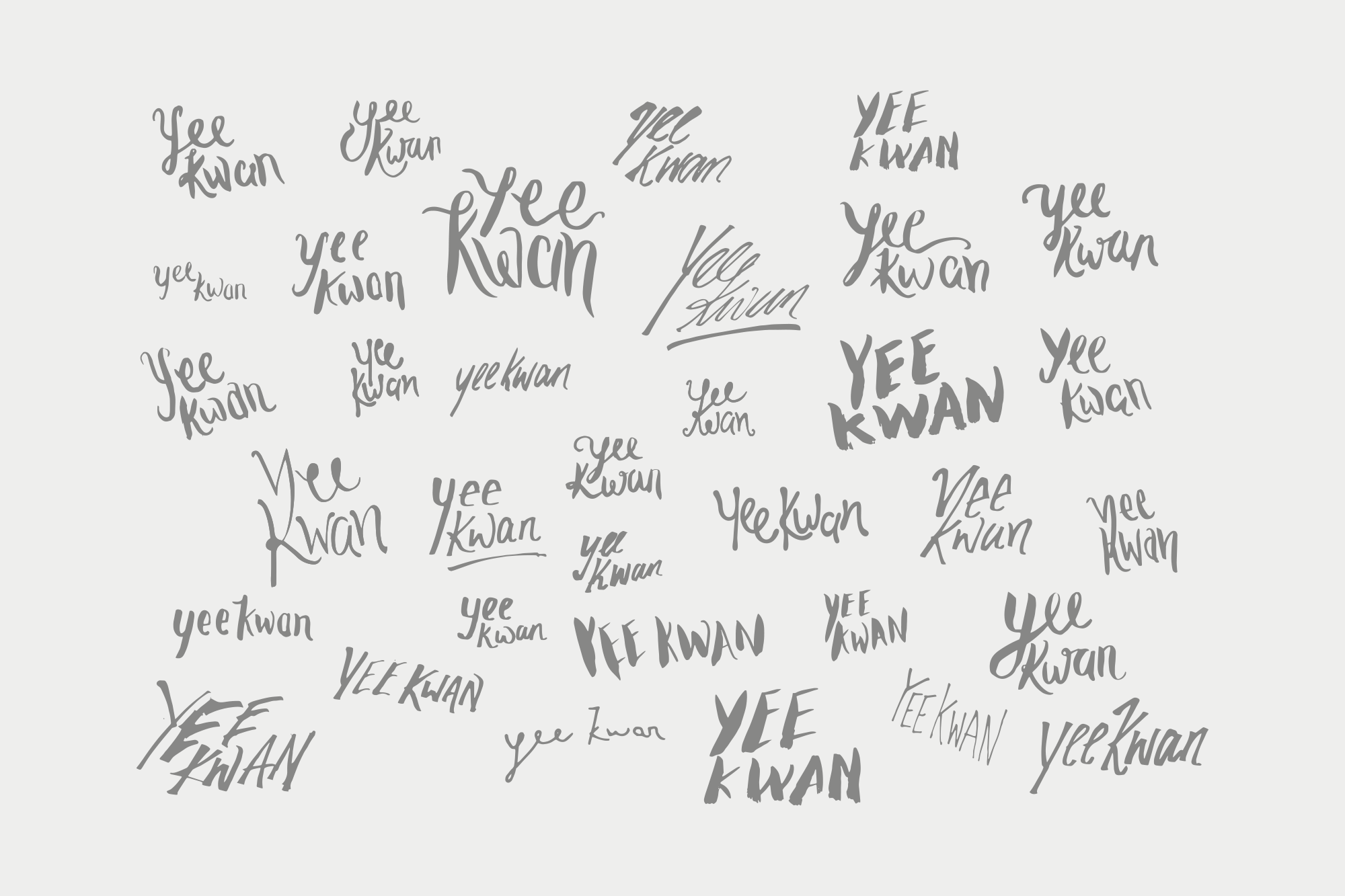
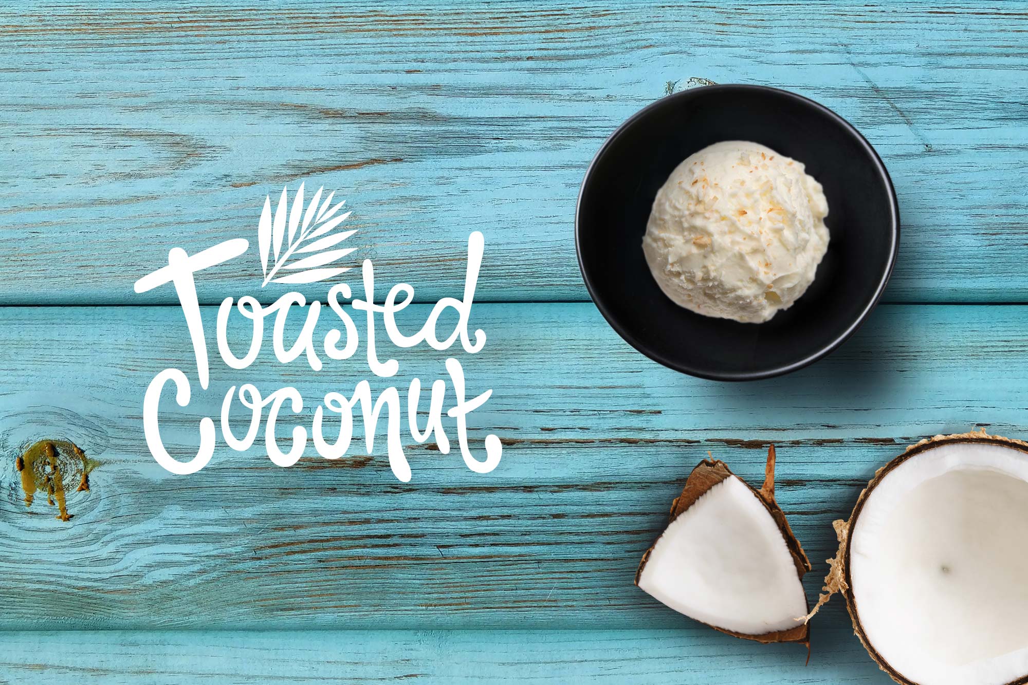
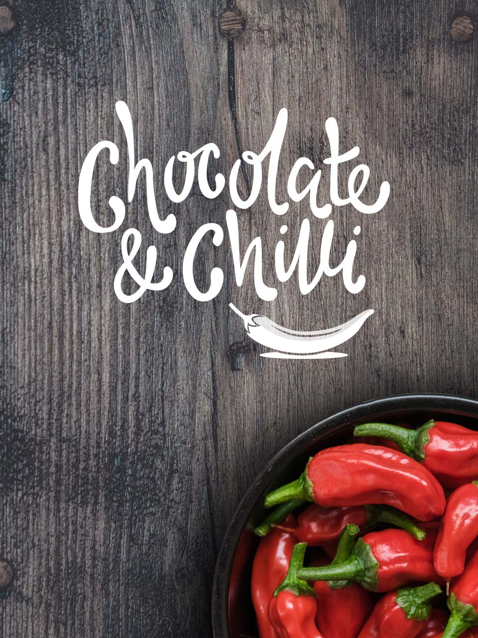
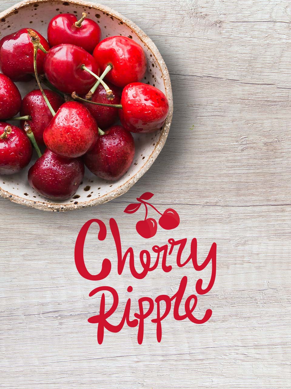
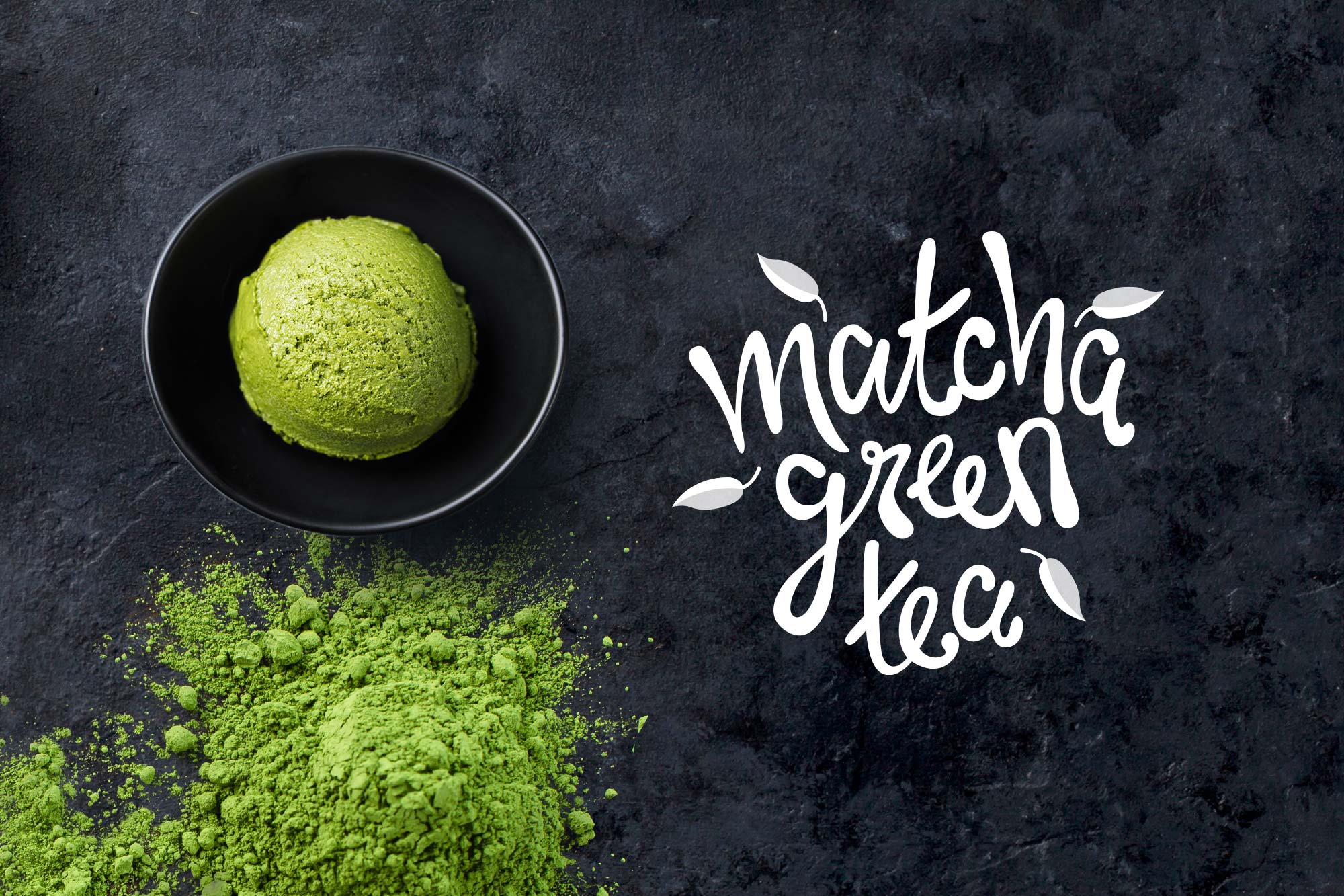
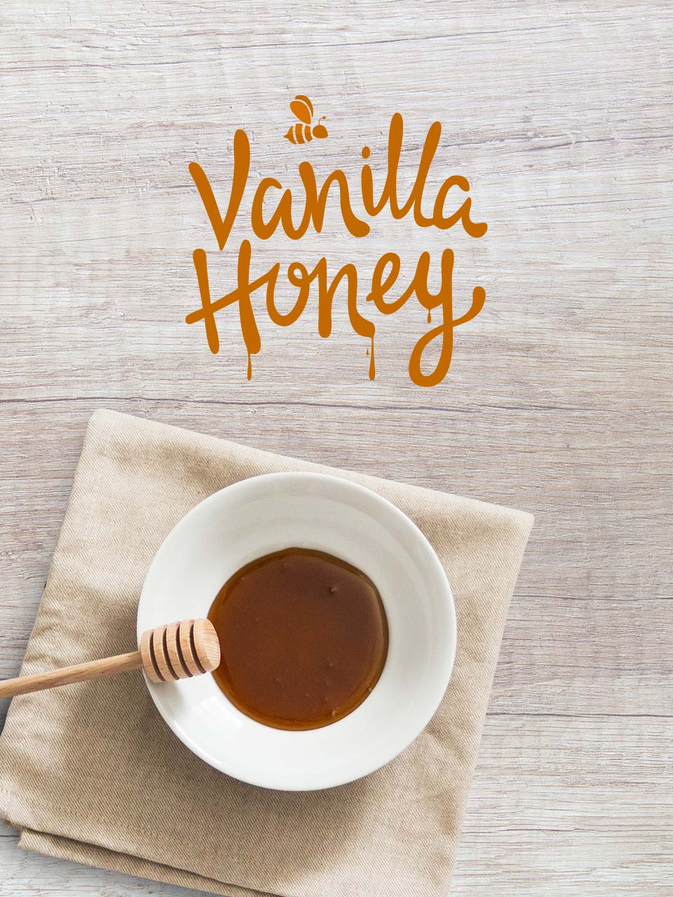
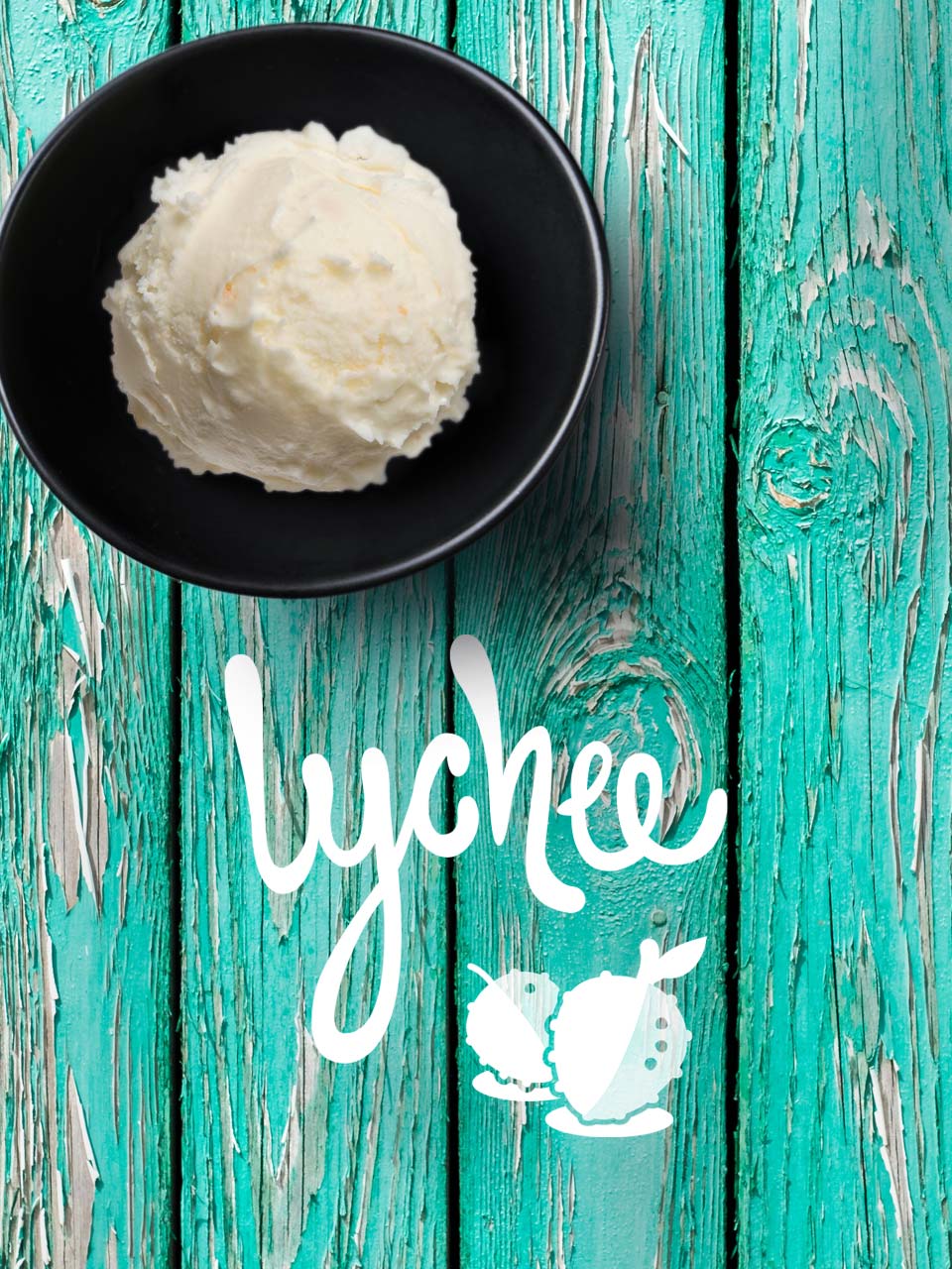
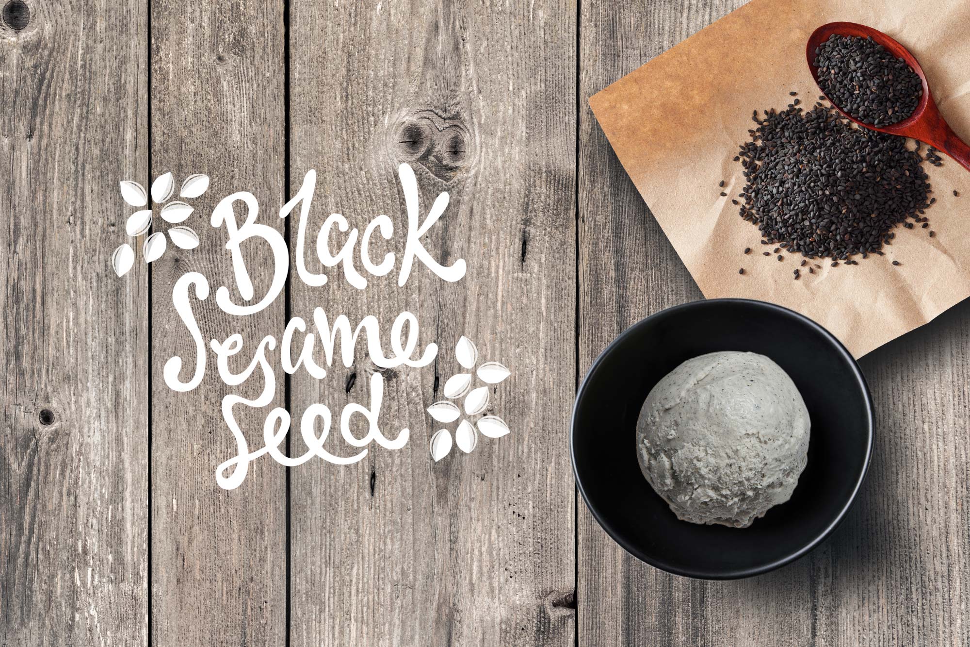
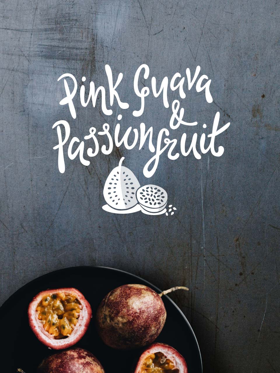
After researching the subject and competition, we knew we wanted the brand to have a hand-drawn quality in the typography.
We experimented with many different types of pen, brush and ink, before landing on the free-flowing 'gloopy' style below, which is used for the logo, flavours and display copy.
The Identity
After researching the subject and competition, we knew we wanted the brand to have a hand-drawn quality in the typography.
We experimented with many different types of pen, brush and ink, before landing on the free-flowing 'gloopy' style below, which is used for the logo, flavours and display copy.


The Story
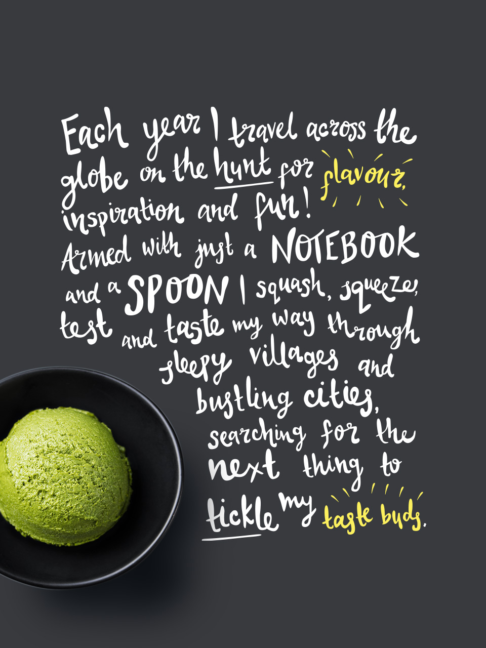
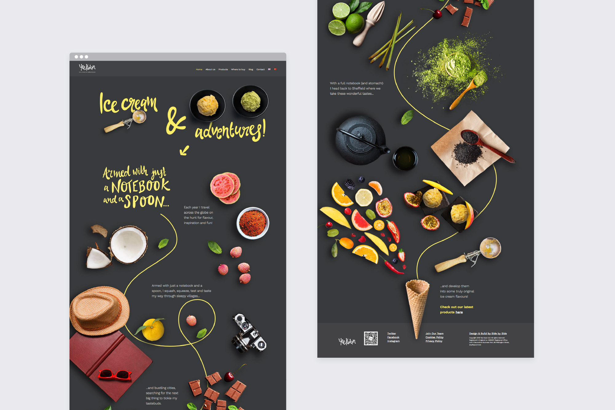
When we first began this project, Yee told us about her Eastern travels as a child, and in later years with her husband and children. This is where the inspiration for her exciting flavours comes from.
This idea of travelling the globe to discover new flavours became the core concept of the brand and the focus for a short story we created for the side of Yee's tubs. 'Armed with just a notebook and a spoon...'.
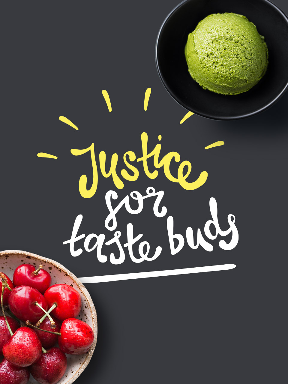
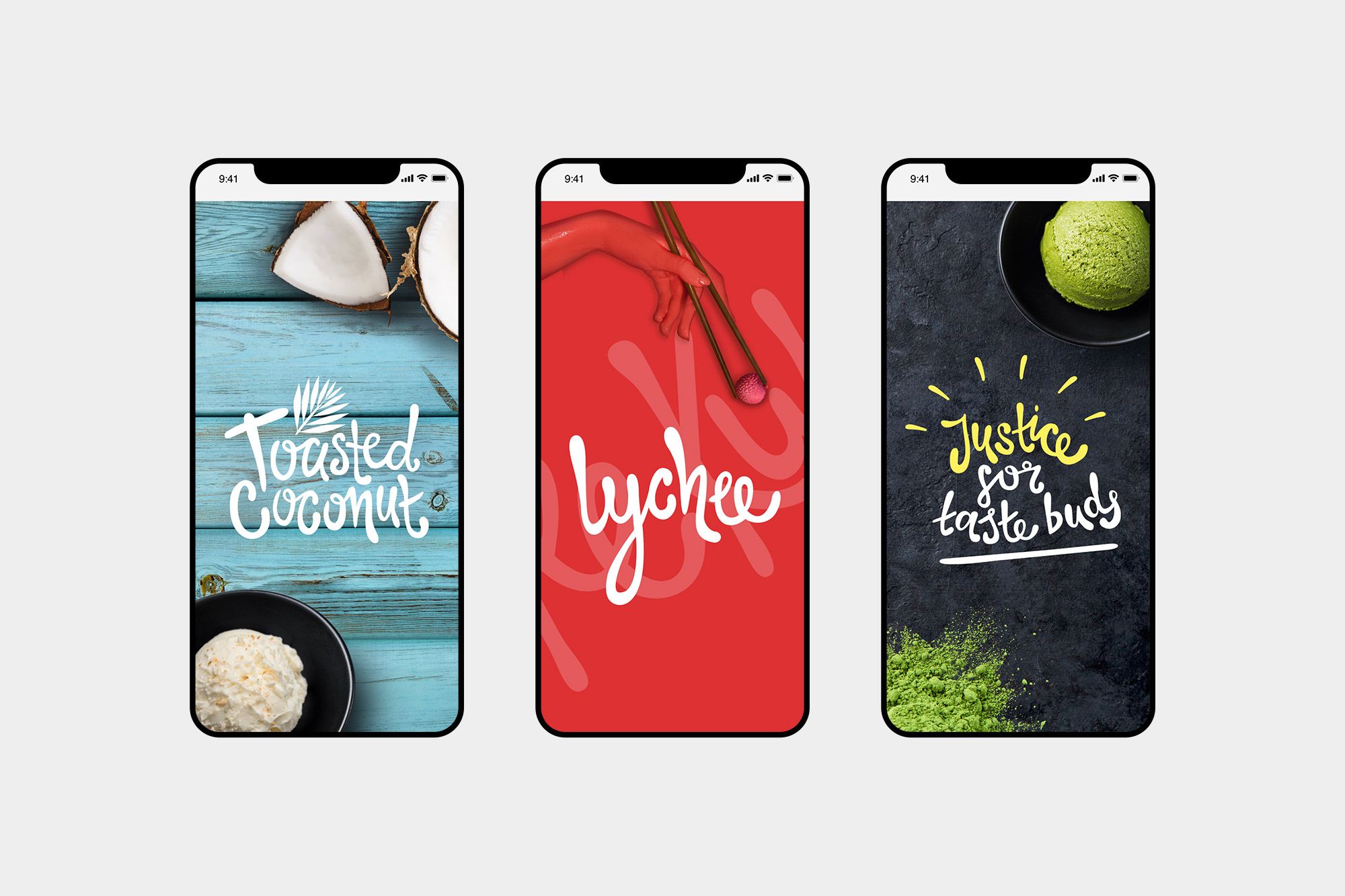
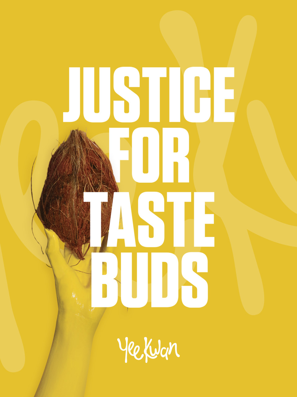
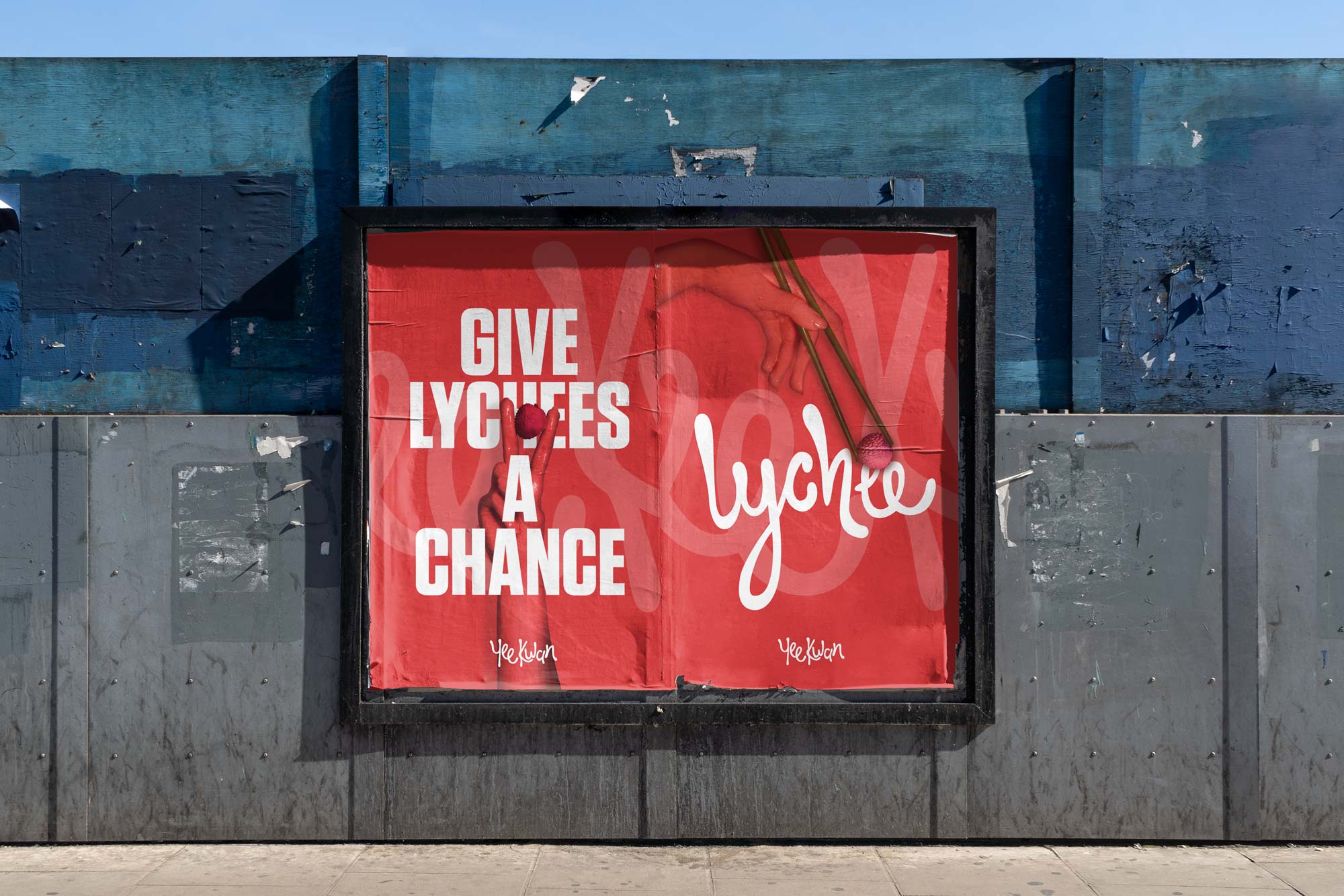
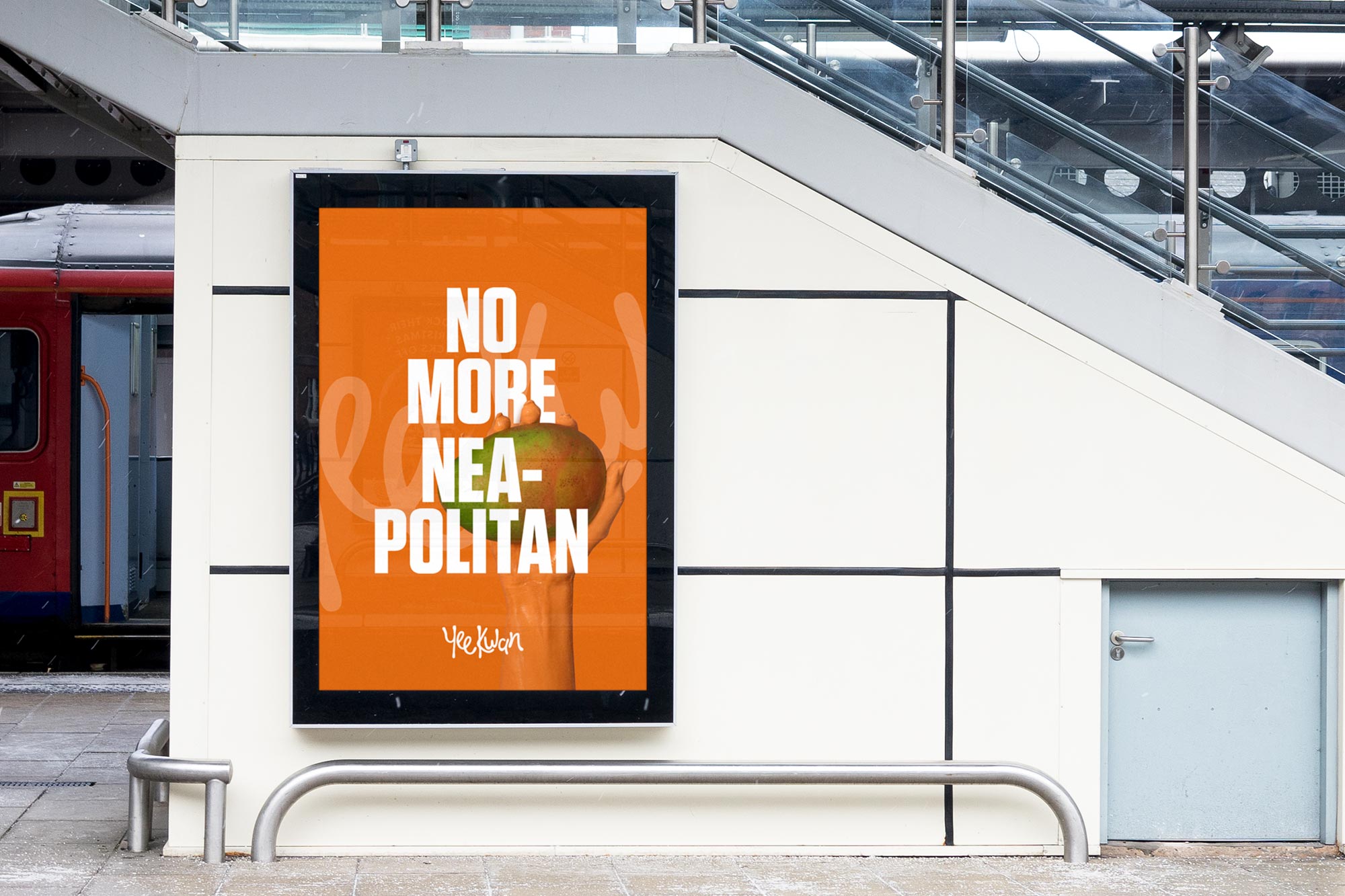
The Advertising
When it came to the advertising style we wanted to keep the imagery playful. We created a fun protest against all that is vanilla.
We painted our arms and created strong protest images using Yee's more interesting ingredients and tounge in cheek messages.
More Work
↓
Taste buds sufficiently whet?
hello@sidebyside.co.uk
© 2013–2020 Side by Side Creative Limited